
Feature
Pivots & Charts
Instant charts & pivots from any Google Sheets data
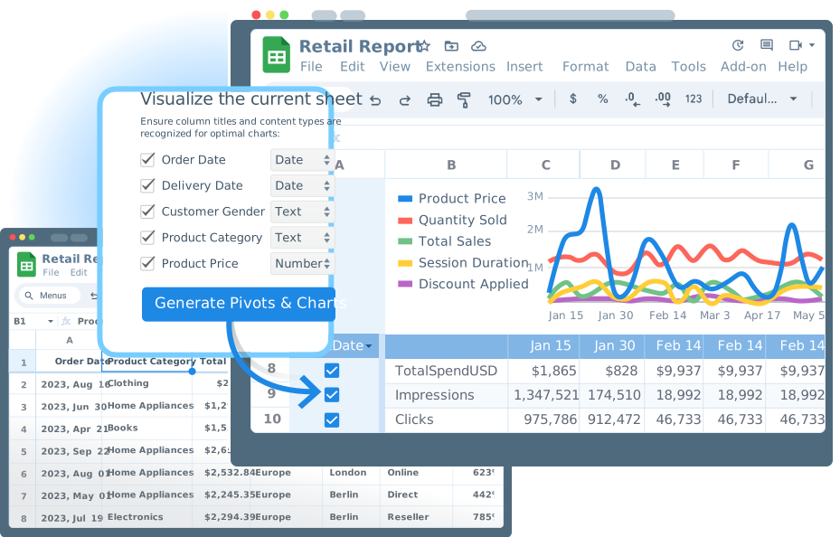
Auto-generate pivot tables, charts, and cohort analyses from any tabular data in Google Sheets — including your Data Marts. One click, zero setup.
Visualize your dataRead the docs →
The analytics system teams trust
Marketplace users
175K+
teams running OWOX from the Google Workspace Marketplace
G2 rating
4.9
296 verified reviews on G2
Connector downloads
156K+
open-source connector installs via npm
GitHub stars
231
the platform is open source — star it, fork it, self-host it
One Click, Two Audiences
From raw table to visual insight — instantly
Pivots & Charts turns any tabular data in Google Sheets into auto-generated visualizations — giving analysts faster exploration and business users instant clarity.
THE ANALYST
Explore data without leaving Sheets
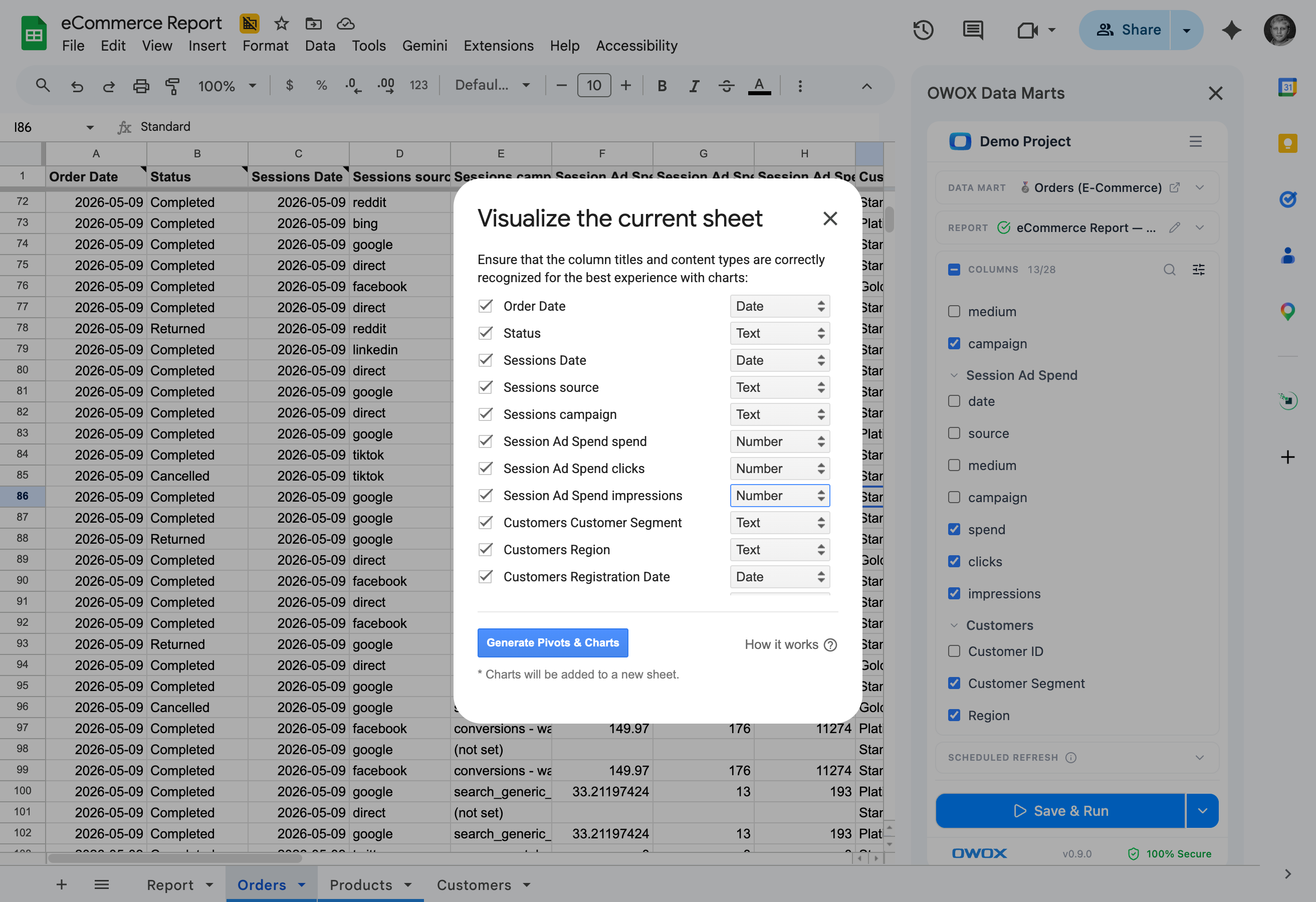
Select columns and let OWOX auto-detect the best chart types, pivot structures, and cohort analyses. Skip the manual chart-building and get straight to the insight.
Analysis speed: measured in clicks, not hours.
THE BUSINESS USER
Charts that build themselves
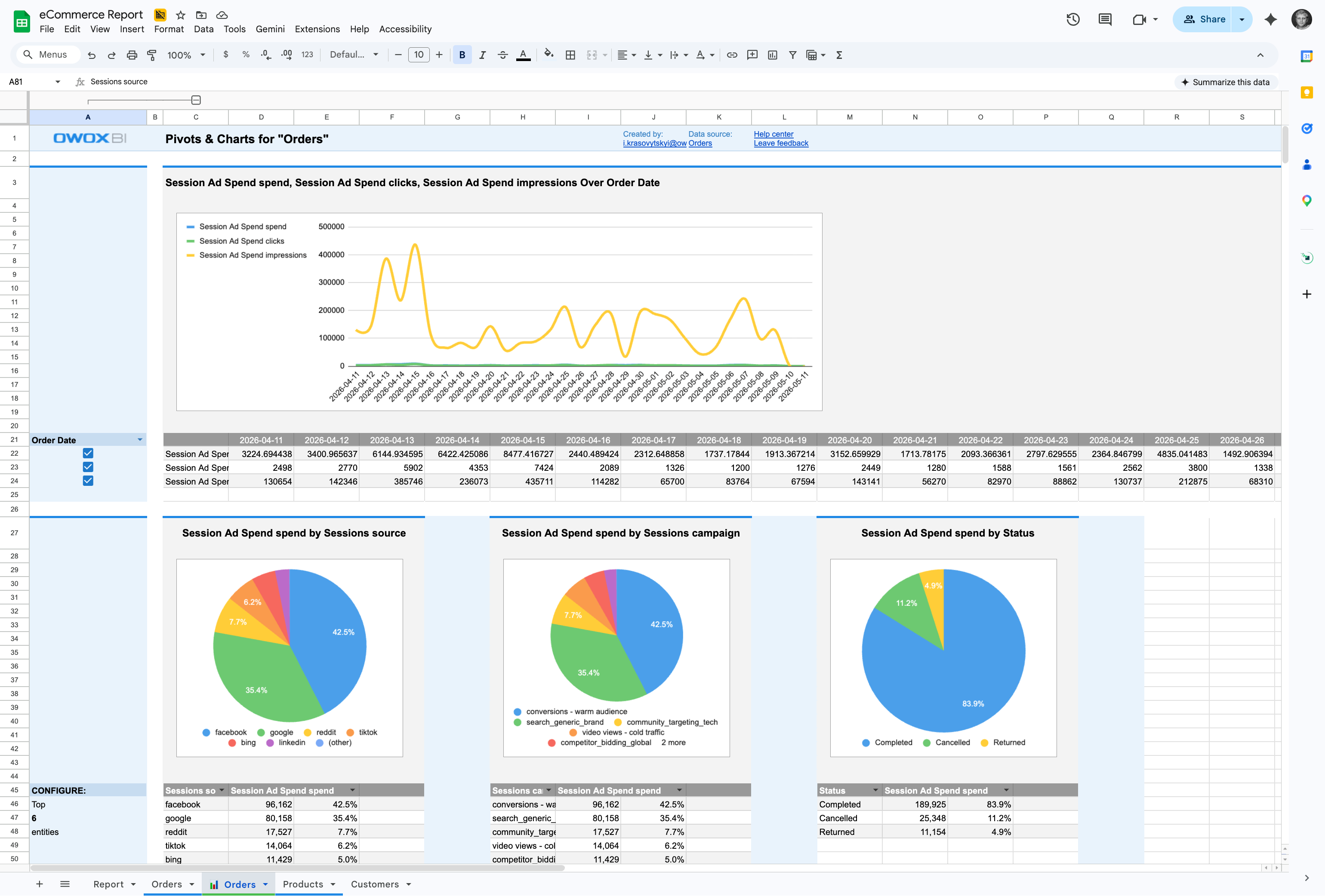
No chart wizard. No formatting headaches. Click the OWOX button and get a complete set of visualizations from your data — bar charts, line charts, pivots, and cohorts, ready to share or present.
Presentation-ready charts from any spreadsheet. One click.
The fastest path from data to visual — Works with your Data Marts or any other data in Google Sheets. Free from the Google Workspace Marketplace — no OWOX account required to start.
For Data Teams3 use cases
For Data Teams
Explore data without leaving Sheets
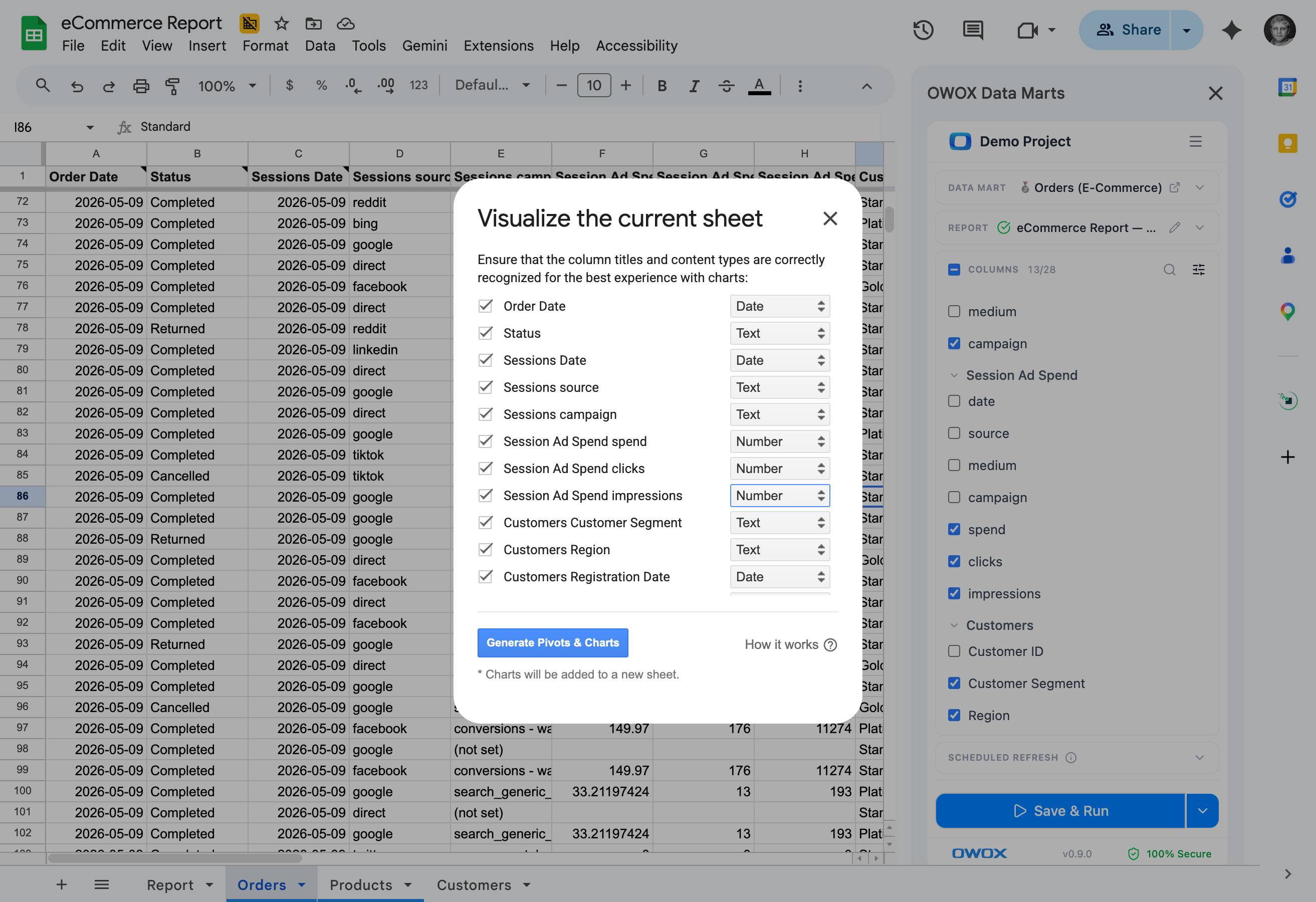
Select a data range and let OWOX auto-detect the best chart types, pivot structures, and cohort analyses.
Auto-detect the best visualization
Select the columns and OWOX analyzes the structure – then generates bar charts, line charts, pivots, and cohorts automatically. No chart wizard configuration needed.
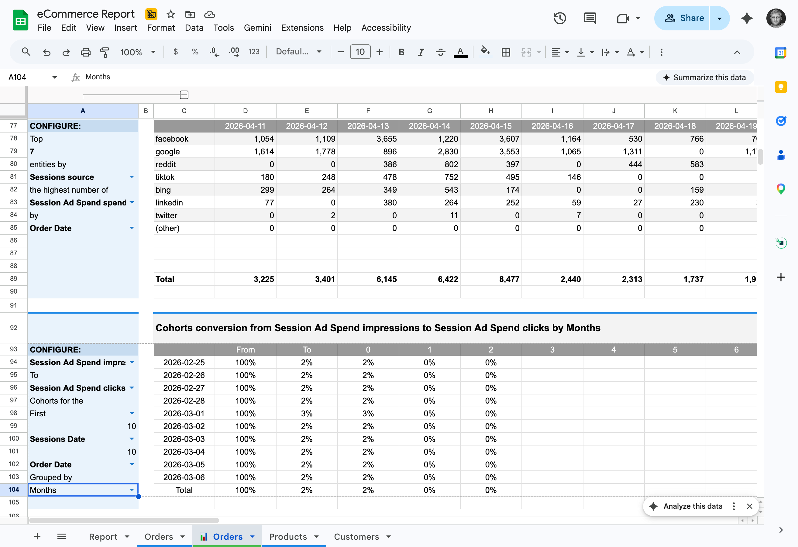
Cohort analysis in one click
Turn any time-series data into a cohort analysis automatically. Retention, revenue cohorts, engagement patterns — generated without writing a single formula.
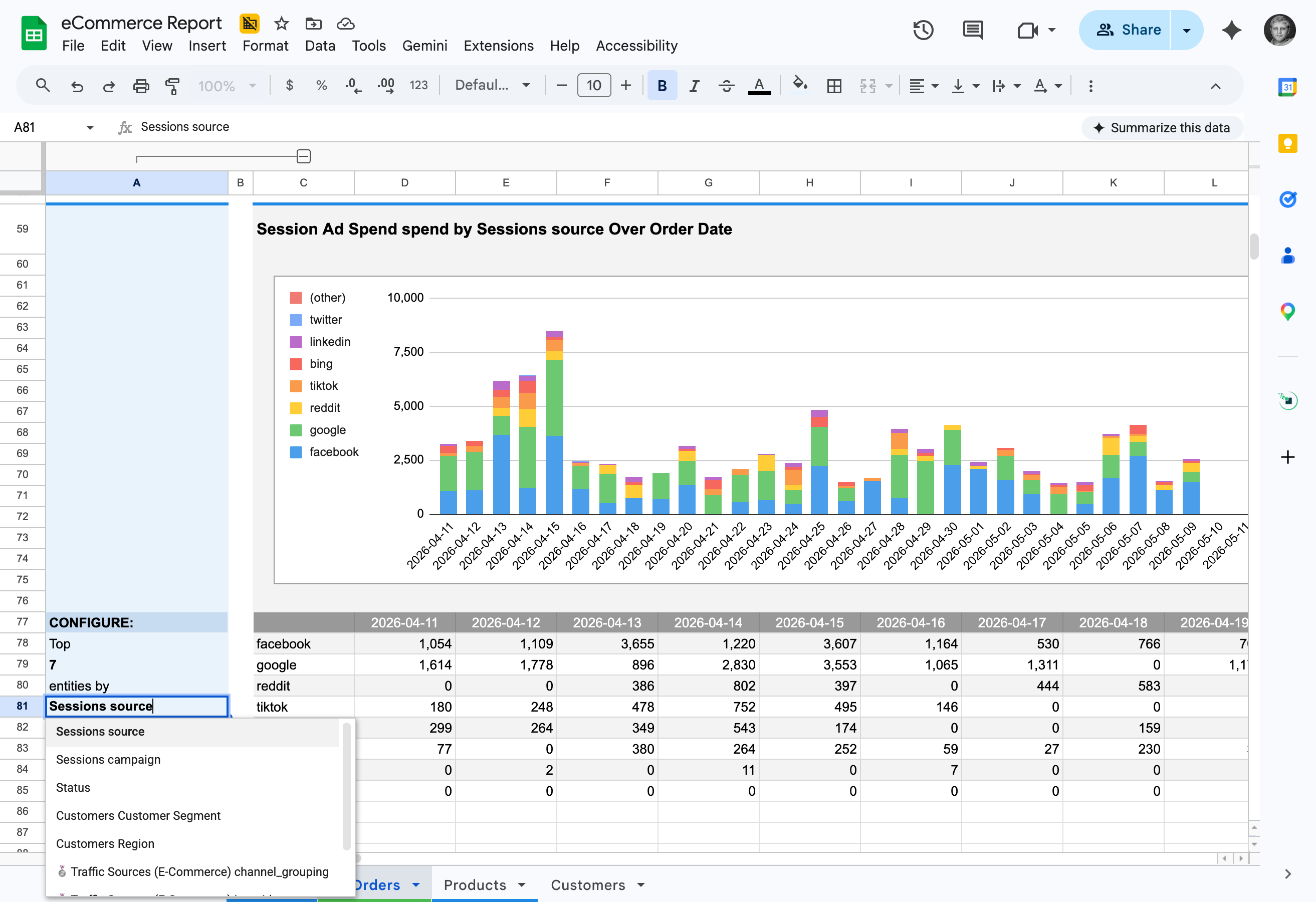
Customize everything after generation
Auto-generated charts are standard Google Sheets charts. Change colors, labels, axes, and formatting — they're a starting point, not a locked output.
For Business Teams3 use cases
For Business Teams
Charts that build themselves
Click the OWOX button and get a complete set of visualizations — bar charts, pivots, and cohorts, ready to present.
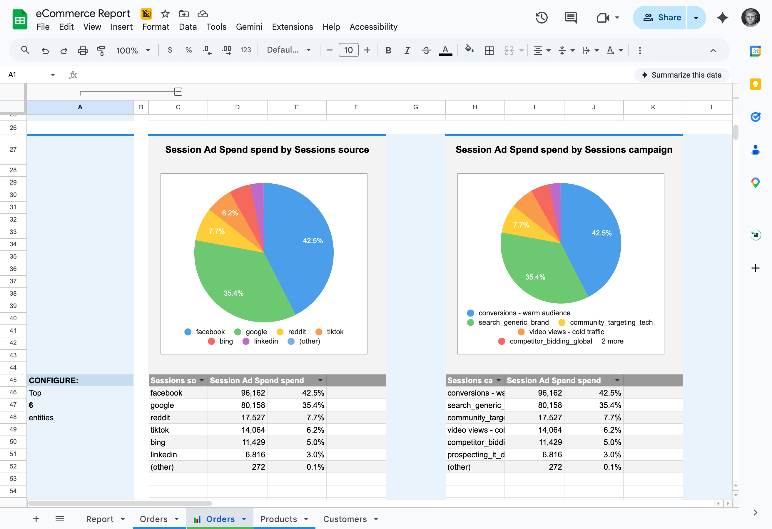
Charts from any spreadsheet data
Works with any tabular data in Google Sheets — not just OWOX data marts. CSV imports, manually entered data, data from other tools — one click and it's visual.
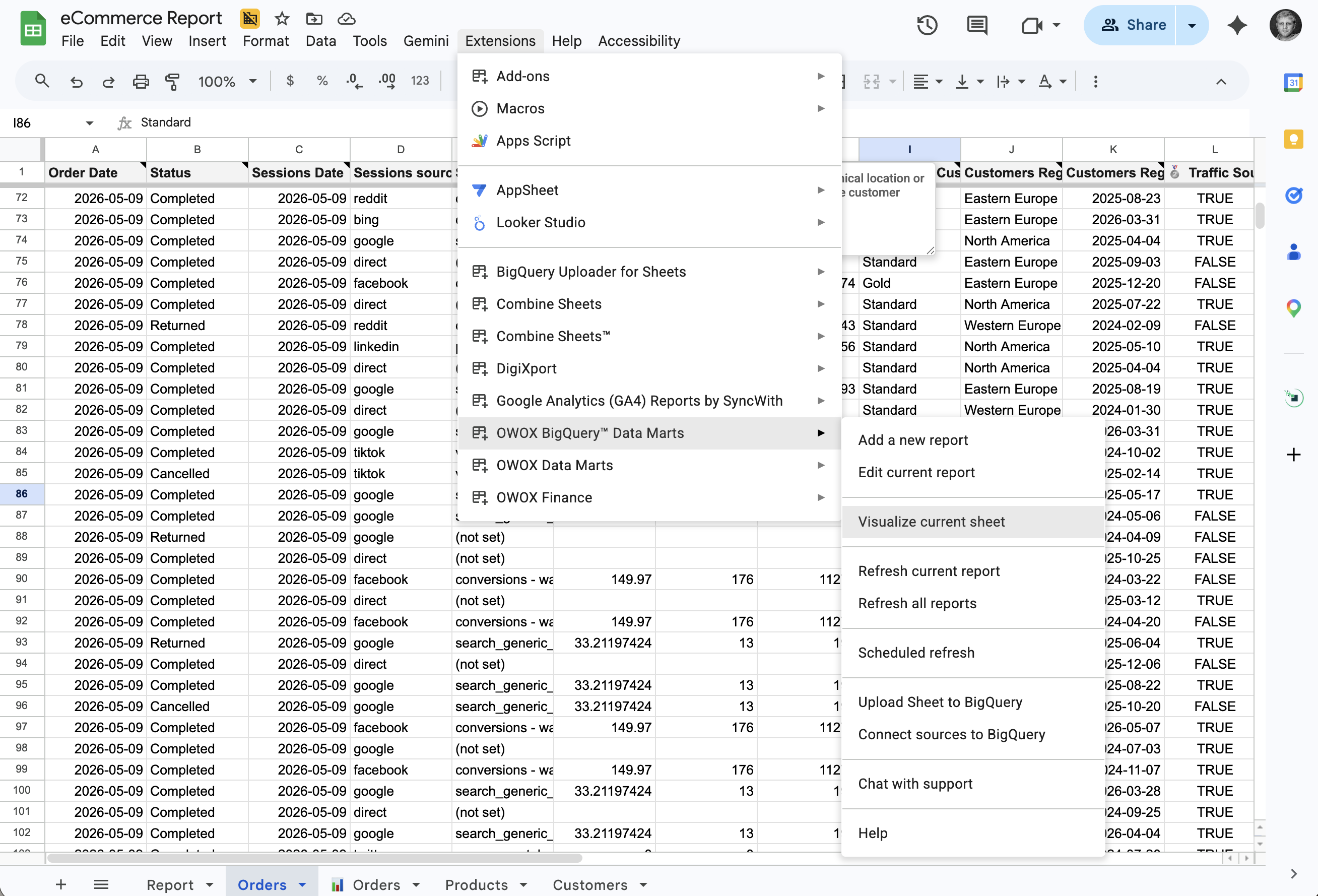
Presentation-ready charts in seconds
Your manager asks for a visual. Click 'Visualize Current Sheet' button and get a complete set of charts and pivots — ready to screenshot, share, or paste into a deck.
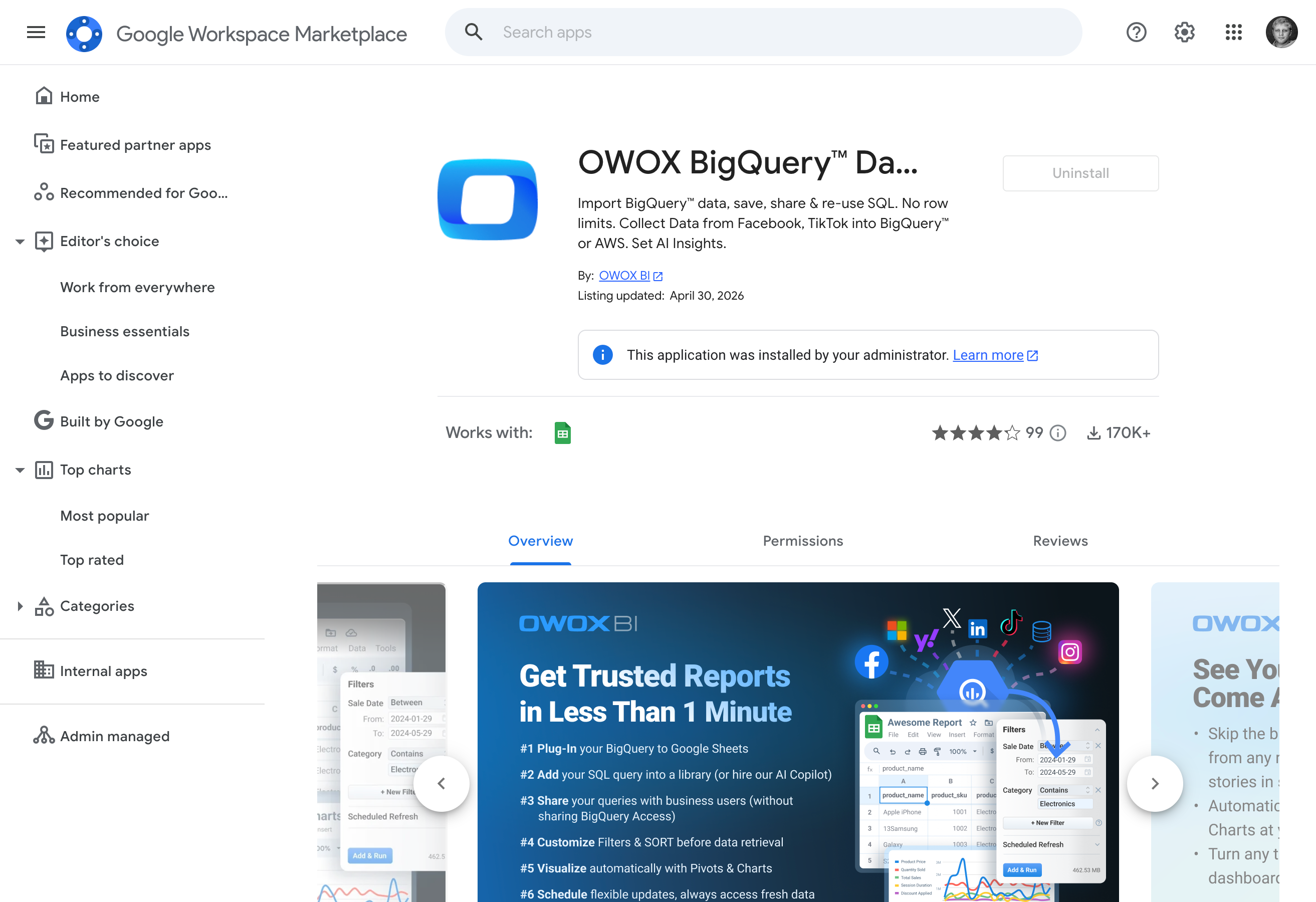
Free, instant, no limits
Pivots & Charts is free in every edition. Install the OWOX BigQuery Data Marts extension from Google Workspace Marketplace and start visualizing immediately. No trial, no paywall.
Editions
Free for everyone, in every plan
Reporting Analyst
Stop being the reporting bottleneck. Hire an Analyst that handles every "quick" question from stakeholders.
Starts at $65 /mo
Hire Reporting AnalystSenior Analyst
Stop running your business blind. Hire a Senior Analyst that unlocks trusted answers to every "why?"
Starts at $90 /mo
Hire Senior Data AnalystEnterprise
Scale self-service analytics with your governance rules and trusted context.
Let's Talk
Talk to SalesWhy teams pick OWOX
Everything business needs

One-click visualization
Automatically generate pivot tables, line, bar & pie charts from any Google Sheets data with a single click

Auto data recognition
Our smart algorithms instantly detect data types and recommend the most effective visualizations for your data.

Customizable displays
Easily tailor charts to meet specific business needs - just swap metrics and dimensions through a friendly UI.

Refresh-friendly designs
Create dynamic reports that automatically update when new data arrives, ensuring your reports remain accurate and current.
FAQ
Frequently asked questions
How does the auto-chart feature work?
Select any range of data in Google Sheets and click the OWOX button. The system automatically analyzes your data structure and generates the most appropriate charts, pivot tables, and visualizations — no configuration needed.
Do I need the OWOX Sheets extension?
Yes. Pivots & Charts requires the OWOX Google Sheets extension, which is available for free from the Google Workspace Marketplace.
What types of charts can it generate?
The feature generates bar charts, line charts, pie charts, area charts, cohort analyses, pivot tables, and more — automatically choosing the best visualization based on your data structure.
Can I customize the generated charts?
Yes. The auto-generated charts are standard Google Sheets charts — you can modify colors, labels, axes, and formatting after generation. They're a starting point, not a locked output.
Does it work with any data in Sheets?
Yes. It works with any tabular data in Google Sheets — not just data from OWOX data marts. You can visualize CSV imports, manually entered data, or data from any other source.
Is this feature free?
Yes. Pivots & Charts is free and included in all editions. Install the Google Sheets extension and start visualizing immediately.
What users are saying
Every claim has a receipt.
Real things real customers said — each quote pinned to a specific claim, straight from the quotes database.
 Nodari RizunFounder & CEO, Pürblack®
“AI, by the nature of the models, will hallucinate. And because of that, you need something which will create guardrails to ensure that there are no hallucinations, that you can trust your data.”
 Mark SimmonsCMO, Pürblack®
“We had six or seven different channels and no single source of truth — it was almost impossible, a lot of guesswork.”
Nodari RizunFounder & CEO, Pürblack®“We regained time. And time is the one resource that never comes back.”